Making four communities behave like one VA.
In the summer of 2024 I joined Technatomy — a service-disabled, veteran-owned federal technology contractor — as the Salesforce UX Expert on a U.S. Department of Veterans Affairs engagement supporting the National Veterans Sports Programs & Special Events office. Four distinct Veteran communities ran as four disconnected web experiences.
My work: define what UX even does inside that delivery model, diagnose the fracture, find the design system that already existed, build the accessibility in from the start, and propose one coherent service.
Unusually, much of the primary record survives — including the narrated presentation I built to carry the argument. This notebook is what that record supports, and it stops where the record stops.
One office, four communities, no shared front door.
The office at the center of the engagement was NVSPSE — the National Veterans Sports Programs & Special Events office, inside the Veterans Health Administration. NVSPSE runs national sports and special-events programs for Veterans, and Veterans with disabilities are its core population. Its digital presence was not one service. It was a family of community platforms — Sports4Vets, Art4Vets, Stipends4Vets, and Grants4Vets — each with its own site, its own login, and its own way of doing things.
The contract vehicle was VEMSIS — Veteran Enterprise Module & Systems Integration Services — and the work sat inside Salesforce: Experience Cloud communities, Lightning, and the integrations around them. The delivery structure was multi-firm — Technatomy's team working alongside i4DM and CGI Federal staff: Salesforce administrators and developers, architects, a business analyst, a Scrum Master, project and release management, and the federal stakeholders above them. On the program's own roster, exactly one seat was UX.
Into that structure, in May 2024, I joined as the Salesforce UX Expert. What that role should do — and how it should work with everyone else — was not documented in the materials I received.
Before any design work, the UX role itself had to be specified — its deliverables, its workflow, and how it plugs into a Salesforce delivery organization.
The materials I received did not define how UX should operate inside the Salesforce delivery model, so I documented one.
The first substantial document I produced on the engagement was not a design. It was a definition. Written for the Pathfinder work, it opens by framing the project "through a UX lens" and then does something more basic: it specifies what UX would deliver, in what order, and how UX involvement runs alongside a Salesforce delivery team — stakeholder interviews and user research, persona development, wireframing, usability testing, feedback analysis, design iteration, and validation before anything is released.
It also names the collaboration explicitly. UX does not sit beside the delivery team; it works through it — with the administrators who own permissions and configuration, the developers who own custom code and integrations, and the analyst who translates business requirements into stories the team can build.
I made the same definition portable. I adapted a teaching deck I had first built in 2018 — "What is UX?" — adding VA-team material, a section on integrating UX with technical development, and an outline for a Salesforce integration deck, so that UX's role and workflow were explicit for the people I was working with, in a form that could be handed to anyone who joined after me.
Both documents survive. The downstream receipt for the definition is in §05 and §07: the technical design work it produced, with accessibility written into its specifications.
What was broken, stated plainly — and the five-question model I proposed to fix it, applied first to the program's content intake.
The org chart was the interface.
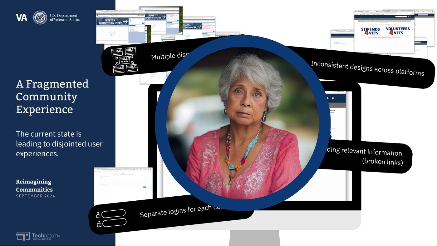
Each community had grown up as its own property, so the experience of using "the VA" was the experience of navigating its internal structure. In my August 21, 2024 assessment to the program's own roster, the problems were mechanical, not aesthetic: siloed systems with no integration and duplicated work; no single sign-on, so a Veteran held a separate account for every community; inconsistent user experience from site to site; data scattered across platforms with no effective way to search or analyze it; and no accessibility compliance — on platforms serving a population for whom accessibility is not an enhancement.
A Veteran registering for an adaptive sports event, checking a stipend, and looking at an arts program was not using one service badly designed. They were using four services that had never been introduced to each other.
Five questions, five decisions.
Rather than redesign four sites, I proposed one service model and stated it the way I documented it at the time — as the questions the design had to answer:
| THE QUESTION | THE DECISION IT FORCES | |
|---|---|---|
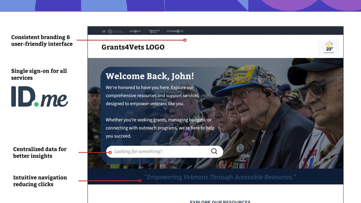
| Q1 | How do four communities become one service? | A single Experience Cloud site with one identity, where the communities are sections of one service — not four destinations. |
| Q2 | What does registration actually gate? | Registration as the front door: verify once, and let verified status — not a new account — carry across every community. |
| Q3 | Where does support live? | Support inside the service — chat and help in the same place the Veteran already is — instead of a phone number on a separate page. |
| Q4 | What makes it consistent? | One design system and one set of design tokens, so four communities stop drifting into four visual languages. |
| Q5 | What makes it usable by everyone it serves? | Section 508 accessibility requirements treated as architecture — inputs to the design, verified in the specifications — not a review at the end. |
The model was a proposal. What survives is the proposal itself, documented and dated — not evidence of its adoption. That distinction is kept everywhere on this page.
The model, applied: content intake
The model's first worked application was unglamorous and concrete: how content gets into the communities at all. Event information, documents, and media were arriving through disconnected channels. I structured an ingest framework — personal OneDrive accounts for review and temporary editing, SharePoint as the content repository, Engage (Microsoft's community platform) evaluated for intake, technical support, and information storage — and recommended Engage as the intake front end, with Salesforce remaining the system the Veterans actually touch.
The work was done in the open, in writing, with the program's solution architect — framework drafts circulated in July 2024, structured around what had to be reviewed, what had to be stored, and what had to reach Salesforce.
The portal's design document, the design-system foundation that already existed, and accessibility treated as architecture.
Designing the door, in the open.
Pathfinder was the engagement's through-line: the community portal under development, and the place where the unified model would either become real or stay a diagram. In August 2024 I authored its technical design document — cover-dated August 13, circulated August 15 — structuring the open decisions as 45 questions across architecture, UI/UX, content, features, data, and security.
The document's most honest feature is its assignment column: questions I could not answer alone were assigned to the roles who owned them — security and compliance questions to the security lead, platform questions to the architects. Its core design problem is stated without decoration: registration has to gate content without locking out the Veterans the content exists for. And its specifications did not treat accessibility as a later phase — Section 508 is written into the design specifications themselves.
The document's file properties carry my name as creator; a draft was circulated to the program lead on August 15, 2024. What was built from it, I do not know.
I didn't invent a visual system. I found the one that existed.
The consistency question (Q4) had a shorter answer than anyone expected. Researching the existing landscape, I found that a design system already existed: the VA Design System (VADS), the component system behind VA.gov, available in Figma — foundations, components, and design tokens included. The communities' branding guidelines were also handled by an outside agency. So the proposal was never "design a new system." It was: adopt the system that exists, and do the translation work — carrying its tokens and components into Salesforce Lightning, where the communities actually live.
That translation work started as self-directed research. On July 18, 2024 — before it appears anywhere in my project messages — I sent myself Salesforce's design-token documentation and a Trailhead UX module, and began working out how Lightning design tokens would carry a consistent brand across communities whose designs had drifted apart.
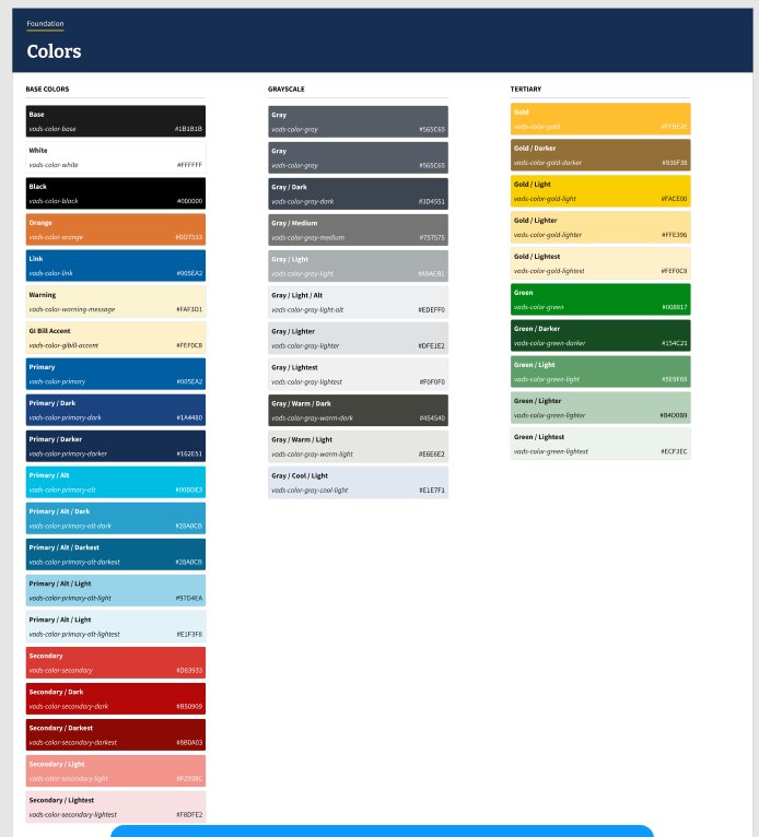
One sentence from my own notes holds the whole chain: outside-agency branding, Lightning design updates, design tokens, the communities deck, and the chat roadmap — all in flight at once.
508 was in the contract, the specifications, and the proposal — because it had to be in the population.
Accessibility on this engagement was not a value I brought to a neutral brief. The program's performance work statement carried Section 508 accessibility requirements as contract obligations, and NVSPSE's core population — Veterans with disabilities — made those obligations the design problem itself, not a compliance layer over it.
So accessibility was placed where it can actually change outcomes: inside the specifications. The PathFinder design document I authored writes Section 508 compliance into its design specifications — "for all portal components" — alongside responsiveness, before any interface existed to remediate. And accessibility has its own place in the stakeholder-facing proposal, presented as part of the design approach rather than an appendix.
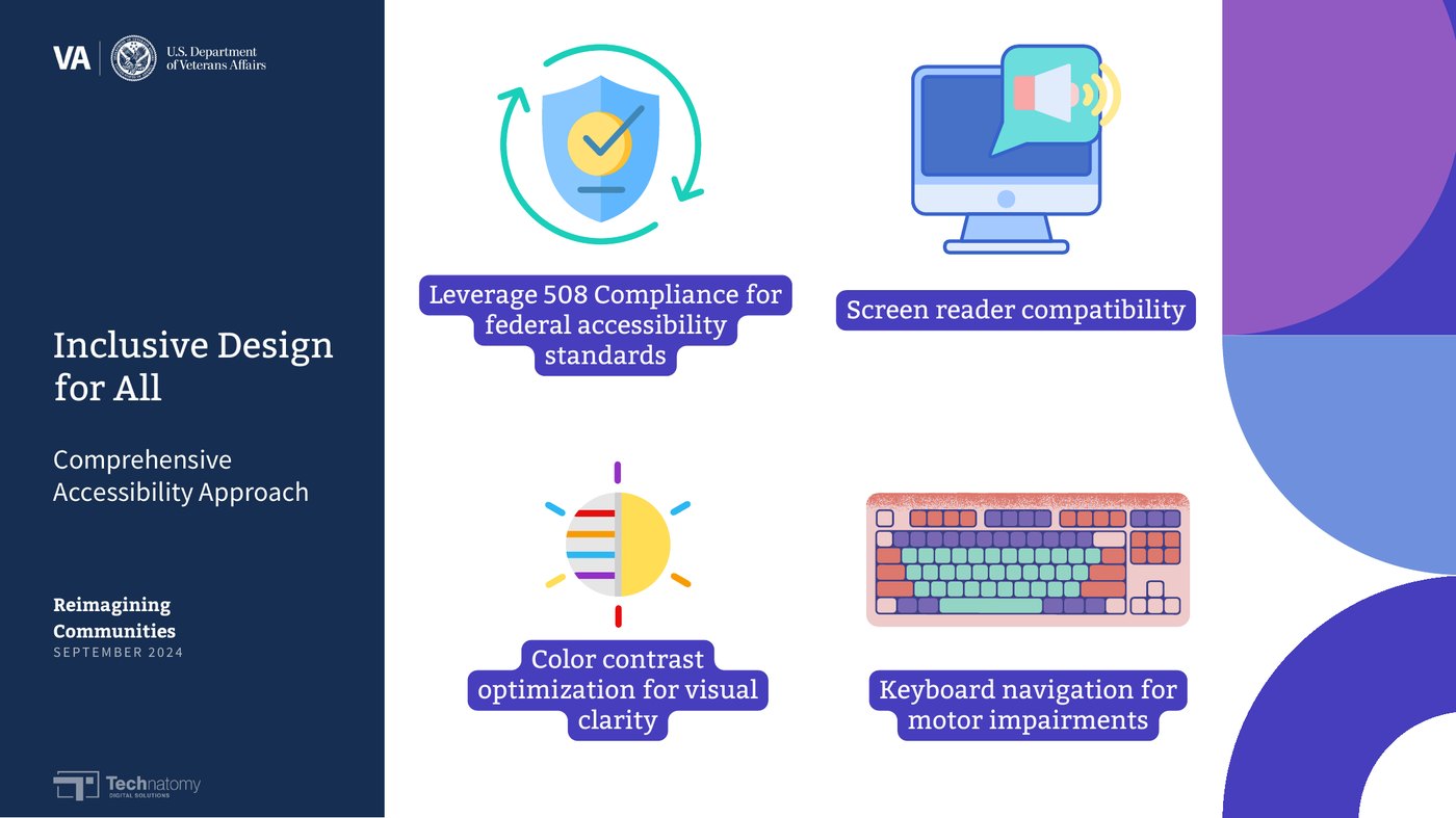
For this population, accessibility is not the review at the end. It is the architecture.
The recommendation, packaged to be understood without its author in the room.
A presentation designed to present itself.
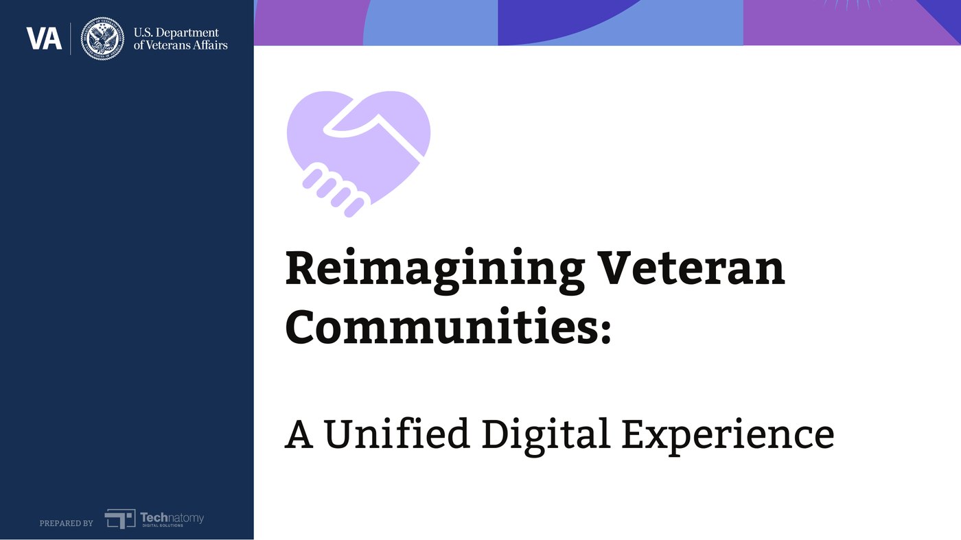
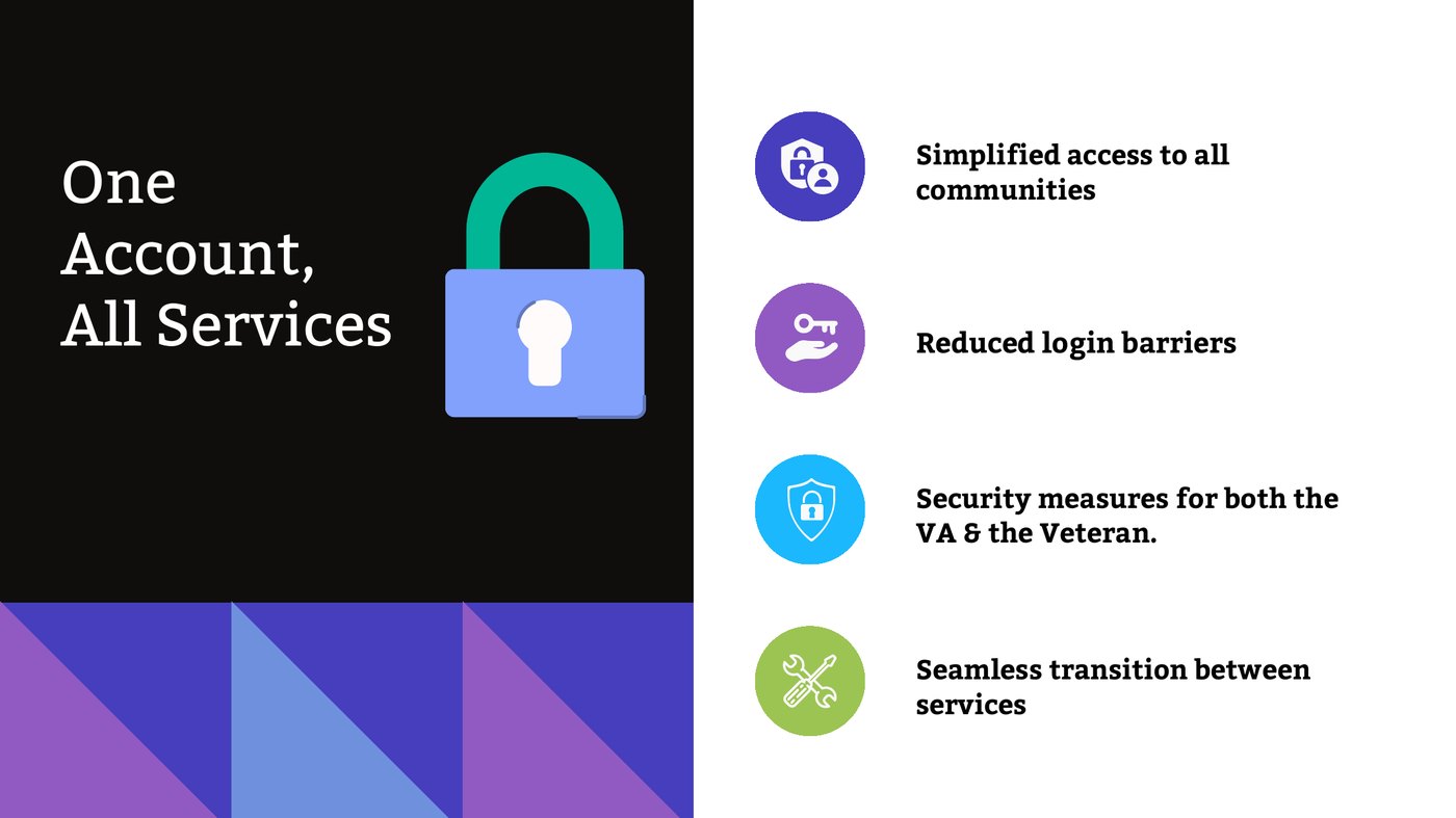
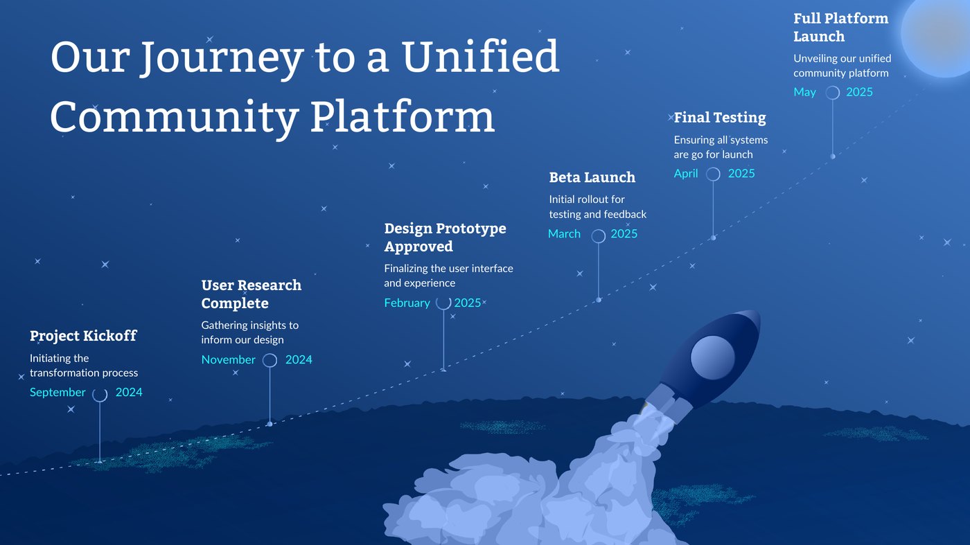
The engagement's findings and proposal were packaged as a self-guided presentation: twenty slides with my own recorded narration — eight minutes, twenty-one seconds — walking from a persona and the fragmented current state, through the unified-platform proposal, single sign-on, chat support, analytics, and the accessibility approach, to a proposed roadmap and close. It was built so the argument could be followed, start to finish, without me standing next to it.
Two kinds of evidence attach to it, and they are different. The title slide identifies the artifact and dates it: "Reimagining Veteran Communities," prepared by Technatomy, September 2024. That it is mine rests on separate evidence — the file lives in my Canva workspace under my name, its exported PDF carries me as author in its metadata, and my narration script and a rehearsal recording survive in my own records from the same weeks. The deck's exact completion date is unresolved in those records, and I am leaving it there.
What the deck documents is a proposal. Its impact slide offered projections built from third-party statistics and estimates; those numbers appear nowhere on this page as results, because they were never results. Whether the presentation was ever shown to its intended audience, and whether anything in it was adopted, remains unknown.
What survives, what was proposed, and what cannot be claimed — kept in separate piles, on purpose.
Four piles, kept separate.
A · AUTHORED & CONTEMPORANEOUS — MINE, AND SURVIVING IN HAND
B · CONTEXT ARTIFACTS — NOT MY AUTHORSHIP IN HAND
C · DOCUMENTED PROPOSALS — MADE, DATED, NOT ADOPTION PROPOSED
D · UNKNOWN — AND WHAT CANNOT BE CLAIMED NOT CLAIMED
A note on names: my narration script also lists a "REG4VETS." The deck's navigation spells "Registration4Vets", shown alongside the other 4Vets service labels — which makes it likely the script's shorthand was for the same service. Likely, not verified, and recorded that way.
The method was the deliverable.
- Define the function before filling it. When a role is new to a program, the operating model — deliverables, workflow, collaborators — is the first design artifact.
- Diagnose the structure, not the screens. Four disconnected sites were one organizational problem wearing four interfaces.
- Find the system that exists before proposing a new one. Adoption of a living design system, plus translation work, beats invention — and is more honest about authorship.
- Put legal obligations inside the specifications. A requirement written into the design document survives handoffs; one kept in a review at the end does not.
- Package the argument to survive your absence. A self-guided artifact keeps working in rooms you are not in.
- Keep the record in piles. Authored, contextual, proposed, unknown — a case study that separates them can be checked, and survives checking.
People should not have to learn your org chart to use your service.